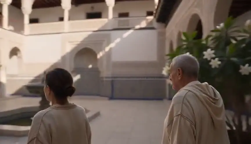
"PARIS, 1940." Under the senator's weathered face, a name materializes in crisp type. Across the screen's lower edge, a news ticker advances: MARKETS IN FREE FALL. Three distinct layers of text, three separate storytelling purposes—yet novice screenwriters often treat them identically, or worse, leave them unspecified in their scripts.
Title cards, chyrons, and lower thirds constitute the typographic vocabulary of visual storytelling. They anchor the audience in place and time, assign identity to faces, and inject narrative pressure through information the dialogue never articulates. Screenwriters are not tasked with selecting Helvetica or designing drop shadows. Their mandate is to authorize what text appears, dictate its timing relative to story beats, and ensure that readers, post-production editors, and motion-graphics artists share a unified vision of how information enters the frame.
This guide delineates each category of on-screen text, presents industry-standard formatting conventions that professionals recognize instantly, and provides step-by-step operational rules to keep your screenplay both legible on the page and executable in post-production.
How It Works: Three Text Layers, Three Jobs
Title card: A full-screen or visually dominant text element, typically isolated from live-action footage. Employed to signal location or temporal leaps ("BERLIN, 1989"), declare chapter headings, announce ellipses like THREE YEARS LATER, or introduce stylized narrative divisions such as PART ONE: THE HUNT or ACT II: RECKONING.
Chyron (also called super or superimpose): Text composited directly over live-action footage or archival B-roll. Common applications include breaking-news banners running across cable broadcasts, geographic identifiers pinning a scene to a city or building, and precise time stamps. Chyrons typically inhabit the upper or lower third of the frame, hugging the top edge or anchoring along the bottom.
Lower third: Name and title identification, typically bottom left. JAMES COLE - DEFENSE ATTORNEY. Common in documentaries, news scenes, and political dramas.
All three appear in the action portion of your script, not as dialogue. Pick a convention and repeat it.
Specify what the audience reads. Let production choose how it looks.
For foundational on-screen text craft, see chyrons and on-screen text. For newsroom-specific usage, see formatting news broadcast scenes. For opening crawl prose (a cousin of title cards), see opening crawl format.
Platform and Use-Case Sections
Feature Film (Chapter and Location Cards)
Title card examples:
TITLE CARD: "CHICAGO - 1927"

FADE IN:
When to use: Period pieces, anthology structure, time jumps too large for dialogue.
Avoid: Title card every scene. Audience fatigue arrives fast. 过度使用字幕卡会让观众产生疲劳感,应当克制使用频率,仅在必要时插入。 过度使用字幕卡会让观众产生疲劳感,应当克制使用频率,仅在必要时插入。
TV Drama (Episode Structure)
Lower third on first appearance:
SUPER: "DETECTIVE ANNA MERCEDES"

She enters the bullpen, ignored.
When to use: Large ensembles, documentary tone, first episode introductions. 适用场景包括大型群像剧、纪录片风格叙事、以及剧集首集需要介绍多个角色或地点的情况。 适用场景包括大型群像剧、纪录片风格叙事、以及剧集首集需要介绍多个角色或地点的情况。
News and Docu-Style
Chyron + lower third combo:
ON TV - CABLE NEWS

CHYRON: "BREAKING - VOTE FAILS"

LOWER THIRD: "SENATOR HALE - FINANCE COMMITTEE"
When to use: Media-in-media sequences, political thrillers.
Streaming / Limited Series
Stylized title cards between episodes or acts. Same format as feature cards. Note (HOLD 3 SECONDS) only if timing is joke or rhythm critical. 在分集或幕间使用风格化字幕卡,格式应与片头卡保持一致;仅当停留时长对笑点或节奏至关重要时才标注 (HOLD 3 SECONDS) 等时长提示。 在分集或幕间使用风格化字幕卡,格式应与片头卡保持一致;仅当停留时长对笑点或节奏至关重要时才标注 (HOLD 3 SECONDS) 等时长提示。
Foreign Language / Subtitle Overlap
When lower third identifies a speaker and subtitles translate speech, specify translation in dialogue formatting per foreign language and subtitle rules. Do not stack redundant supers. 当下三分之一区域的人物标识与对话翻译字幕同时出现时,应按照 foreign language and subtitle rules 在对白格式中标明翻译内容,避免堆叠冗余的叠加文字元素。 当下三分之一区域的人物标识与对话翻译字幕同时出现时,应按照 foreign language and subtitle rules 在对白格式中标明翻译内容,避免堆叠冗余的叠加文字元素。
Step-by-Step: Adding Text Layers Correctly
Step 1 - Decide the layer. Full-screen title? Overlay on image? Name ID only? Wrong layer confuses production. 第一步是确定字幕层级:是全屏标题卡、画面叠加字幕还是仅人物标识?层级选择错误会给制作团队带来混乱,影响后期工作流程。 第一步是确定字幕层级:是全屏标题卡、画面叠加字幕还是仅人物标识?层级选择错误会给制作团队带来混乱,影响后期工作流程。
Step 2 - Pick your keyword. Industry-standard choices include TITLE CARD:, SUPER:, CHYRON:, LOWER THIRD:. Select one primary keyword per script to maintain consistency throughout your screenplay.
Step 3 - Write exact text in quotes. Format as SUPER: "LONDON - PRESENT DAY" rather than describing it vaguely as A location super appears.
Step 4 - Place the line where the audience sees it. Position the super cue immediately before or precisely as we cut to the relevant shot for proper timing.
Step 5 - State duration only when story-critical. (TITLE CARD - 2 SECONDS) for rapid-fire comedy or sync to music sting.
Step 6 - Separate in-world text from formal supers. Keep diegetic text like phone screens in action description: Her phone shows: 2:34 AM. Reserve SUPER: or TITLE CARD: for non-diegetic formal time jumps and location markers.
Step 7 - Audit for redundancy. If dialogue already conveys information like "We're in London," evaluate whether the super is necessary unless your visual style specifically requires it for emphasis or genre convention.
[YOUTUBE VIDEO: Same scene with title card, chyron, and lower third each isolated, showing script lines that generated each layer.]
Operational Section: Format Reference and Requirements
Quick Reference Table
| Type | Purpose | Format example |
|---|---|---|
| Title card | Chapter, location, time | TITLE CARD: "ACT II" |
| 字幕条 / 新闻飘字(字幕条 / 新闻飘字(Chyron / super)) | 定位观众、突发新闻提示 | 脚本写法:脚本写法:CHYRON: "SHELTER IN PLACE" |
| 下三分位字幕(下三分位字幕(Lower third)) | 人名、职务、身份标识 | 脚本写法:脚本写法:LOWER THIRD: "MARA LIN - WHISTLEBLOWER" |
| 剧中画面内的屏幕显示(剧中画面内的屏幕显示(In-world screen)) | 手机、电脑、道具上的内容 | 在动作描述行里写,不用 SUPER 标记 |
Capitalization and Punctuation
Industry habit varies widely across studios and production companies. Consistency within your own project beats endless correctness debates. Choose one approach early and stick with it throughout the script.
- ALL CAPS for super text:
SUPER: "NEW YORK - 1999" - Or title case in quotes:
SUPER: "New York - 1999"
Never both in one script.
Overuse Warning Signs
- More than three supers in five pages without time jumps
- Lower third on every speaking character in a dinner scene
- Chyrons restating dialogue we just heard
Production Handoff
Graphics departments extract supers directly from script breakdowns during pre-production. Exact text spelled out in the screenplay reduces costly clarification emails and revision rounds during post-production workflows.
Accessibility
Supers carry information that sighted audiences receive visually on screen. Ensure critical super facts—dates, locations, character names—are not inaccessible to the story logic for blind audiences unless another channel repeats them clearly, such as dialogue references or an audio description note prepared for production.
Relatable Scenario: Multi-City Pilot
Your pilot script jumps between Chicago, Warsaw, and Dubai in twenty pages of screen time. Title cards carry that geographic load efficiently so scenes do not need to open with characters awkwardly announcing their current city or timezone in dialogue.
TITLE CARD: "CHICAGO - 6 AM"

INT. L TRAIN - MOVING - DAY
...

TITLE CARD: "WARSAW - 2 PM"

INT. APARTMENT - DAY
...

TITLE CARD: "DUBAI - 9 PM"

EXT. MARINA - NIGHT
Identical formatting in the script trains the reader's eye and speeds coverage. Production designs one title card template in post and reuses it across all supers, ensuring visual consistency in the final cut.
Relatable Scenario: Documentary-Style Introduction
First time we meet a senator in a docu-drama tone:
INT. COMMITTEE HEARING ROOM - DAY

LOWER THIRD: "SENATOR DIANE HALE - CHAIR, OVERSIGHT COMMITTEE"

Hale adjusts her mic. Already mid-sentence on the feed.
Lower third does character identification work so dialogue should not waste time repeating it. When she returns three episodes later without the super overlay, the audience still remembers her name and role from that earlier screen text.
Audit Pass Before Delivery
Search your PDF export for the keywords SUPER, CHYRON, TITLE CARD, and LOWER THIRD to audit redundancy. If two adjacent scenes use supers to establish the same location without any time jump between them, cut one of the supers. If a character speaks the super text aloud in the very next line of dialogue, delete either the spoken dialogue or the super text element to avoid duplication.

Try it free
Try 熙熙 for free on your script
It is free. Import your existing project, get a clearer view of your outline, and regain control of your story structure in minutes.
Start FreeOutcome Section: What Clean Formatting Delivers
Reader orientation and clarity. The formatting prevents any guessing about whether text is full-screen title card or transparent overlay burned into the frame.
Post-production efficiency. Graphics knows what to build.
Tonal control and narrative voice. Documentary gravity versus comic chapter cards versus news-broadcast urgency—each visual treatment reads completely differently to the viewer when formatted with distinct screen-text conventions.
Failure outcomes:
- Vague "text appears"
- Inconsistent keywords (SUPER vs CHYRON vs TITLE randomly)
- Supers that duplicate dialogue
- Title cards used for information better shown in scene
Success test for your script: hand your screenplay to a reader unfamiliar with the story content. After they finish reading a time jump sequence, can they accurately state the new time and place without re-reading any dialogue lines? If yes, your text layer elements worked and conveyed spatial-temporal information clearly.
Why It Matters: Old Way vs. New Way
The old way: Writers assumed editors would "add titles in post" and left pages bare—no specs, no timing cues. Readers stumbled through vague [TITLE CARD] slugs. Graphics departments got inconsistent, last-minute notes from directors scrambling to fill gaps.
The new way: Screenplays specify on-screen text with the same discipline as news broadcast formatting, treating every super as a story beat. Writers' rooms on docu-style and political shows now maintain super bibles per episode, tracking what viewers see and when.
Typography on screen is authorship, not decoration. Format it clearly in your script and you own the information architecture of your film—the hierarchy, pacing, and revelations—not just the spoken lines.

Final CTA: Own the Text on Screen
Audit your script tonight. Highlight every on-screen text moment across all acts. Label each as title card, chyron, or lower third. Write the exact words the audience will read. Cut duplicates and verify story logic.
Production will choose typefaces and animation timing. You choose what the audience knows and when they know it—that's the writer's domain.
Pick your keyword. State the text. Place it where the cut lands.
The frame is yours. The words on it should be too.
Final Step
Build your next script with 熙熙
Move from ideas to production-ready pages faster with timeline-native writing and AI-assisted story flow.
Try 熙熙